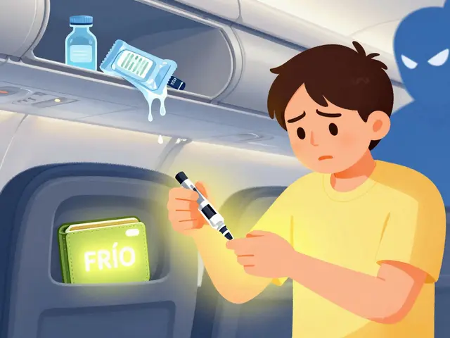
When you pick up a prescription, you might not think much about the small stickers on the bottle. But those icons - the yellow triangle with a person sleeping, the red circle with a crossed-out glass, the blue square with a hand holding a pill - are life-saving tools. They’re designed to tell you, in seconds, what you need to know to stay safe. Yet, for many people, they’re confusing. In fact, over half of Americans misinterpret at least one warning on their medication labels, according to Consumer Reports. That’s not just a minor oversight. It can lead to hospital visits, dangerous side effects, or even death.
What Do These Icons Actually Mean?
Pharmacy warning icons are visual shortcuts. They replace long paragraphs of text with simple symbols that can be understood quickly, even by people with low literacy or those who don’t speak English. The most common ones you’ll see include:- Yellow triangle with a sleeping person - This means the medication can make you drowsy. Don’t drive or operate machinery.
- Red circle with a crossed-out glass - Avoid alcohol while taking this drug. Mixing them can cause dangerous reactions.
- Blue square with a hand holding a pill - Take with food to reduce stomach upset.
- Red diamond with a skull and crossbones - High risk of serious side effects. Follow instructions exactly.
- White rectangle with a dropper and a slash - For external use only. Do not swallow.
But here’s the problem: consistency doesn’t always happen. While CVS uses 14 warning labels, Walgreens uses 17, and independent pharmacies often use 23 or more. That means the same drug might come with different icons depending on where you fill it. A patient might get one warning at their neighborhood pharmacy and a completely different one at a chain store. That confusion increases the chance of mistakes.
Why Color Matters - and Why It Doesn’t
Color plays a big role in how people interpret warnings. Most patients assume red means “danger,” yellow means “caution,” and blue or green means “just a suggestion.” That’s not how it’s supposed to work.In reality, color isn’t standardized in the U.S. Some pharmacies use yellow for sedatives, others for allergy warnings. A 2019 study in U.S. Pharmacist found that 42% of patients associate color with severity - but that doesn’t match what pharmacists intend. One patient might see a yellow label and think, “This isn’t serious.” Meanwhile, the pharmacist put it there because the drug could cause a life-threatening reaction.
Even worse, some symbols are just plain misleading. The “external use only” icon - a dropper with a slash - is meant to say “don’t swallow.” But in a 2019 study, 90.7% of patients thought it meant “don’t apply it to your skin.” One Reddit user shared how their mother took eye drops by mouth because she thought the dropper symbol meant oral use. She ended up in the ER.
It’s not that the icons are bad. It’s that they’re used inconsistently and without enough context. A symbol that works for someone with high health literacy might be completely unclear to an elderly patient with poor eyesight or someone learning English.
Who’s Responsible for Getting This Right?
You might think the drug manufacturer prints the warnings. But they don’t. Pharmacists are the ones who add the warning stickers after reviewing your medical history, other medications you’re taking, your age, and your risk factors.That means a pharmacist has to know:
- Which drugs cause drowsiness
- Which ones interact with alcohol
- Which ones need to be taken on an empty stomach
- Which ones are dangerous for people with kidney disease or heart conditions
They’re also supposed to consider your personal risks. A 75-year-old with balance problems might need a stronger warning for sedatives than a 30-year-old. But studies show that 38.7% of pharmacists apply too many warnings - six, seven, even ten stickers on one bottle. When there’s too much clutter, patients tune it all out. It’s like shouting in a noisy room - nothing stands out.
Large pharmacy chains have started using computer systems to help. These tools suggest only the top 1-3 most critical warnings based on your profile. CVS and Walgreens now use this tech in most stores. But smaller pharmacies? Many still rely on memory or outdated printed guides. That’s why you might get a different experience walking into two different pharmacies with the same prescription.
What’s Changing - and What’s Coming
The FDA has had enough. In September 2022, they released draft guidelines calling for a national standard of just 12 warning icons. No more 14, no more 17. Everyone uses the same 12. CVS already announced they’ll cut their labels from 14 to 12 by the end of 2023. Walgreens plans to follow by mid-2024. The goal? Final rules by mid-2024, full rollout by 2026.That’s a big deal. Standardization means less confusion. It means if you move across state lines, your warning labels won’t change. It means a Spanish-speaking patient in Texas and one in Maine will see the same symbols.
But standardization isn’t the only innovation. Some pharmacies are testing augmented reality. Kaiser Permanente ran a pilot where patients scanned a QR code on their label and watched a 30-second video showing how to take the medicine. In that study, comprehension jumped from 58% to 89%. That’s huge.
Even more advanced? AI-driven personalized labels. Researchers at the University of Pittsburgh tested a system that adjusted warnings based on your age, literacy level, and past behavior. For someone who often missed doses, it added a reminder to take the pill at the same time every day. For someone with memory issues, it emphasized “do not crush.” Adherence improved by 32%.
Still, not everyone can use tech. About 24% of seniors don’t regularly use smartphones, according to Pew Research. So any new system must still work with paper labels and clear symbols.
What You Can Do to Stay Safe
You don’t have to wait for the system to fix itself. Here’s how to protect yourself:- Ask for a verbal explanation. Don’t just take the bottle and go. Ask the pharmacist: “What does this sticker mean? Why is it here?”
- Read the text, not just the icon. The icon is a shortcut. The words underneath give the full warning. If the text says “May cause dizziness,” don’t ignore it because the icon looks mild.
- Take a photo of your label. Keep it on your phone. If you forget what a symbol means, you can look back.
- Use the ISMP’s free tool. The Institute for Safe Medication Practices offers a Medication Safety Self-Assessment - it’s free, no login needed. It walks you through common warning labels and tests your understanding.
- Speak up if something doesn’t make sense. If you’re confused, say so. You’re not being difficult - you’re preventing a mistake.
And if you’re helping someone else - a parent, a spouse, an elderly neighbor - don’t assume they understand. Walk them through each sticker. Ask them to explain it back to you. If they say, “It means I can drink wine,” but the label says “avoid alcohol,” you’ve just caught a potential disaster.
The Bigger Picture
Medication errors cause at least 7,000 deaths in the U.S. every year, according to the FDA. A big chunk of those come from misreading labels. The warning icons were created to fix that. They’ve already reduced some errors by 28%, according to the Pennsylvania Patient Safety Authority.But they’re not magic. They need to be clear. They need to be consistent. And they need to be paired with human conversation. A sticker can’t replace a pharmacist saying, “This will make you sleepy - don’t get behind the wheel.”
By 2030, experts estimate that standardized, well-designed warning labels could prevent 12,000 to 18,000 adverse drug events each year. That’s thousands of hospital stays avoided. Thousands of lives saved.
It’s not about perfect symbols. It’s about making sure the ones we have actually work - for everyone.
What does the yellow triangle with a sleeping person mean on a medication label?
It means the medication can cause drowsiness or dizziness. You should avoid driving, operating heavy machinery, or doing tasks that require alertness while taking it. This warning is common with pain relievers, sleep aids, antihistamines, and some antidepressants.
Why do different pharmacies use different warning icons?
Until recently, there was no national standard in the U.S. Each pharmacy chain developed its own system. CVS uses 14 icons, Walgreens uses 17, and independent pharmacies often use even more. This inconsistency confuses patients. The FDA is pushing for a single set of 12 standardized icons to be used nationwide by 2026.
Can I ignore a warning if I’ve taken the medicine before without problems?
No. Warnings are based on risks, not past experiences. Just because you didn’t feel drowsy last time doesn’t mean you won’t this time. Factors like age, other medications, diet, or health changes can affect how your body reacts. Always follow the current label instructions.
What should I do if I don’t understand a warning icon?
Ask the pharmacist. Don’t guess. Say, “I’m not sure what this symbol means.” Most pharmacists are happy to explain. You can also look up the label on the Institute for Safe Medication Practices website or take a photo of it and ask a trusted family member or friend to help you interpret it.
Are warning icons used in other countries?
Yes, and some systems are more consistent. New Zealand uses a nationally standardized set of yellow Cautionary and Advisory Labels (CALs) that have improved patient understanding by 22% compared to the U.S. The UK uses just 9 standardized icons, which cut misinterpretation rates from 39% to 17% after implementation in 2015. These systems prove that standardization works.
Do warning icons help non-English speakers?
Yes, they’re one of the most effective tools for non-English speakers. The FDA reports a 40% drop in errors among patients who don’t speak English when symbols are paired with simple text. That’s why many warnings include both a picture and a short phrase - to bridge the language gap.


Vicki Yuan
3 January / 2026Just picked up my new antidepressant and saw the yellow triangle-thought it was just a generic caution. Turns out I almost drove to work after taking it. Thank you for this breakdown. I’m printing this out and taping it to my medicine cabinet.
Also, I didn’t know ISMP had a self-assessment tool. Just took it. Got 3/5 wrong. Yikes.
Pharmacists, please stop putting 8 stickers on one bottle. I tune out. I literally can’t tell what’s critical anymore.